
|
SADA Main Page
Free Downloads
Visualization
Sampling
Data Exploration
Risk Assessment
Geospatial Analysis
Geospatial Simulation
Decision Analysis
Cost Benefit Anaylsis
MARSSIM
TRIAD
Other Tools
Technical Support
Documentation
Coming Soon
Training
Education
Applications
Join SADA User Group
RAIS
Bugs
People
Email Us
Current SADA Webpage Vistors Previous SADA Webpage Visitors  |
Spatial Analysis and Decision Assistance
|
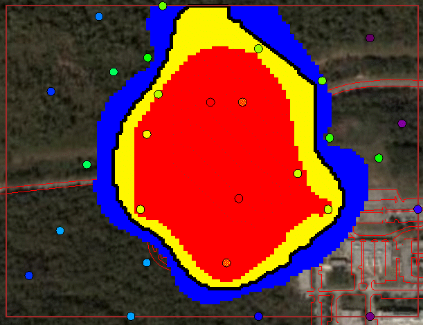
Cost Benefit AnalysisSADA can produce site-specific cost-benefit curves that demonstrate the specific relationship between a given remedial cleanup goal and the corresponding cost. This cleanup goal can be a custom concentration value, a human health risk scenario , or an ecological risk level . The frameworks that govern the Decision Analysis also apply here. This include such concepts of decision scale(site or block), overburden, uncertainty bands, and other engineering considerations. Part of that discussion is recreated here. In the following image we see a typical delineation of an area of concern. or an AOC. An AOC is a spatially defined area that my require remediation or further investigation. When fully developed, an AOC is comprised of four components. First, the dark boundary line represents the current and best estimate for the AOC. While it may be the best boundary in a statisical sense, there may be in fact a great deal of uncertainty about where exactly the boundary line should fall. The red area represents the region that should be part of the AOC with great certainty. The yellow region, located just inside the boundary, represents a part of the area of concern that might actually be clean but due to spatial variability must be included in the AOC. The blue region corresponds to the region that would not be normally included in the AOC but the classification is not completely certain. A fourth region actually exists - overburden(not seen here). Overburden applies to 3d assessments where clean media resides on top of contaminated media and must be moved prior to remediation.
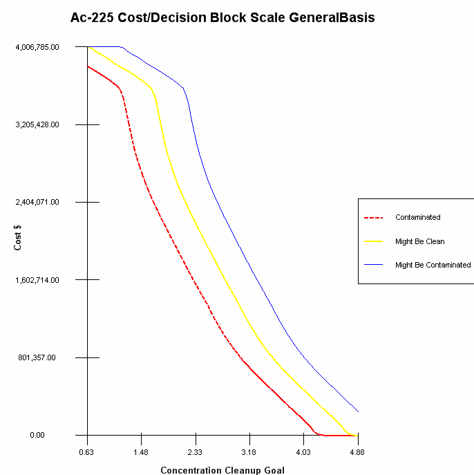
The image above is for a particular cleanup goal, for example 3pCi/g. If that goal were relaxed to 4pCi/g the area occupied by the AOC and all uncertainty bands would certainly be smaller resulting in a smaller volume and cost. If that goal were further restricted to 2pCi/g, this region would increase in size. A cost-benefit curves performs the AOC calculation for very small increments between the smallest and largest data/model values involved. The result is a cost benefit curve seen in the following image. This cost curve is cumulative with each band colored to corresponding directly to regions described in the image above. Overburden costs can also be included in this graph (not shown here). Note that if the cost analysis had been conducted with respect to risk, the x axis would be risk or HQ values instead of concentration.
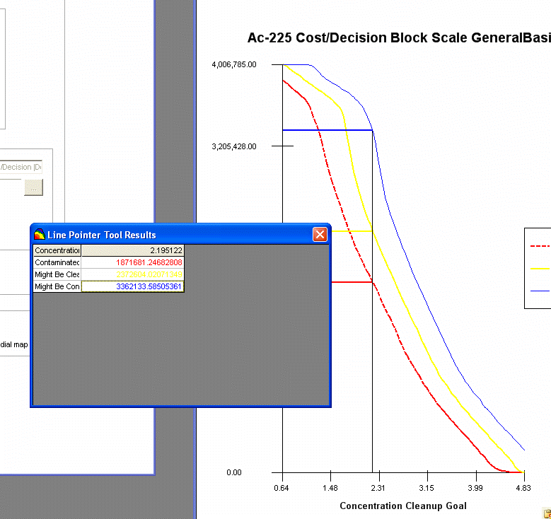
An important thing to look for is areas of the curve where small changes in the remediation goal result in large changes in the cost. If such a trend occurs in the neighborhood of the established goal, some negotiation may result in a slightly different goal. Some useful tools are available to help read the cost-benefit curve. Line tracers follow the mouse and report on the curve values a dynamically updated table.
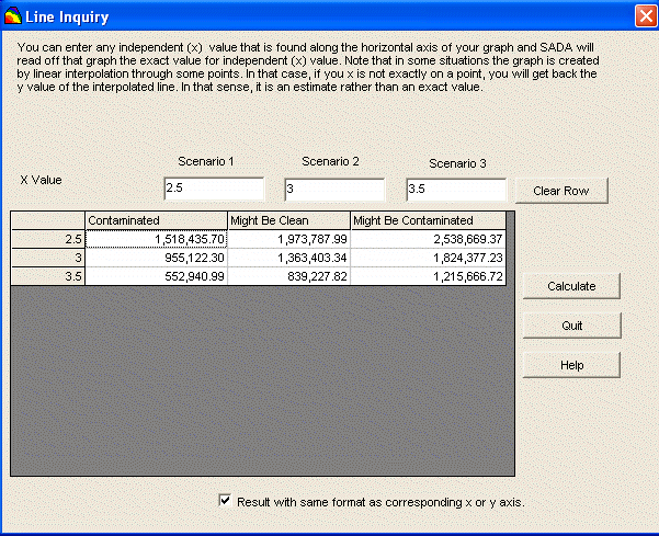
A line reader/scenario development tool permits users to enter up to 3 different cleanup/screening goals and calculates the resulting cost in each of the three regions.
|
SADA Main Page Free Downloads Visualization Sampling Data Exploration Risk Assessment Geospatial Analysis Geospatial Simulation Decision Analysis Cost Benefit Anaylsis MARSSIM TRIAD Other Tools Technical Support Documentation Coming Soon Training Education Applications Join SADA User Group RAIS Bugs People Email Us

